University of Laughs
笑の大学
Koki Mitani & Daisuke Matsuno
Publishing Date: 2021.01
笑の大学
Koki Mitani & Daisuke Matsuno
Publishing Date: 2021.01
三谷幸喜 創作を語る
《笑之大學:三谷幸喜談創作》中國版
三谷幸喜 松野大介/著 林煌/譯
《笑之大學:三谷幸喜談創作》中國版
三谷幸喜 松野大介/著 林煌/譯


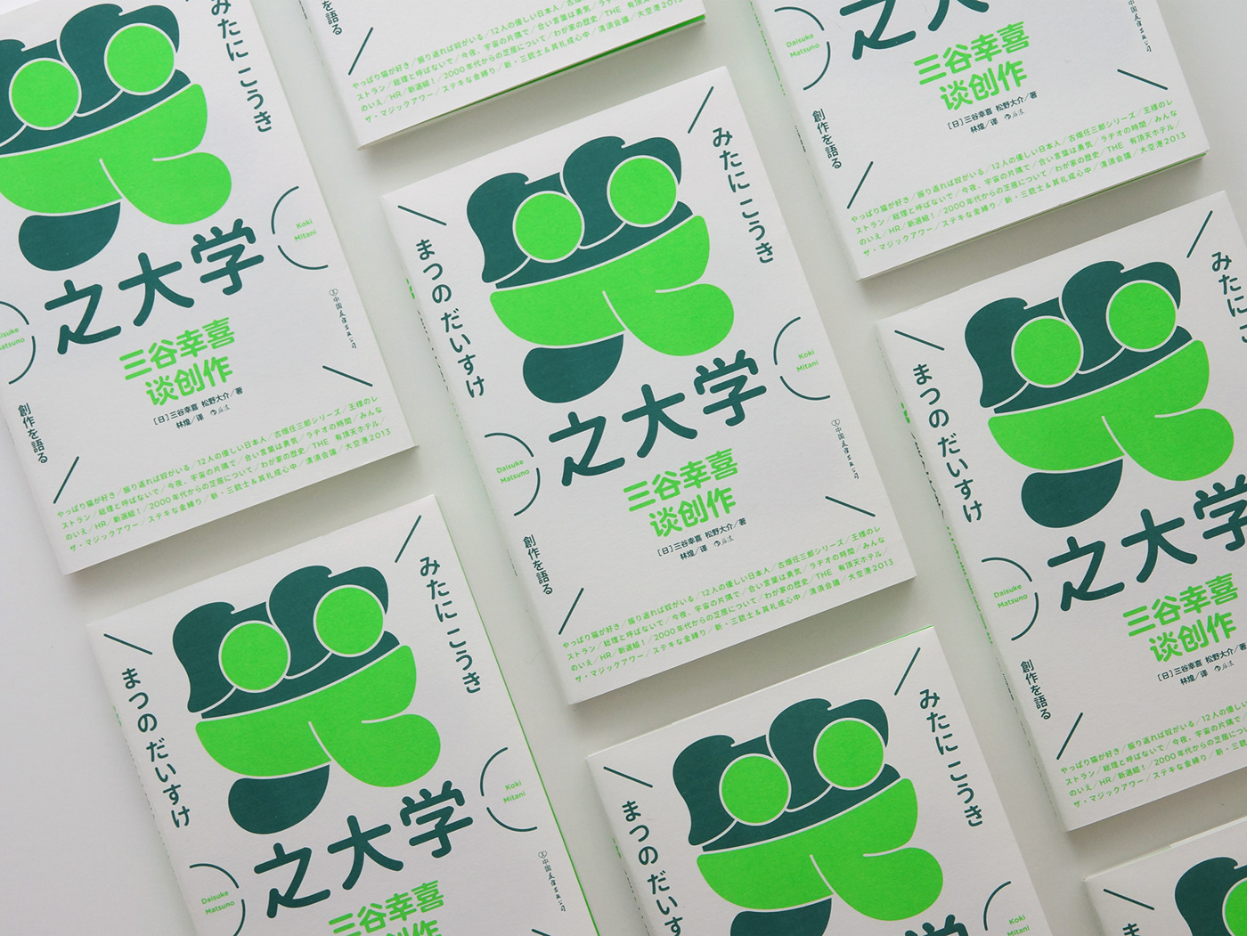
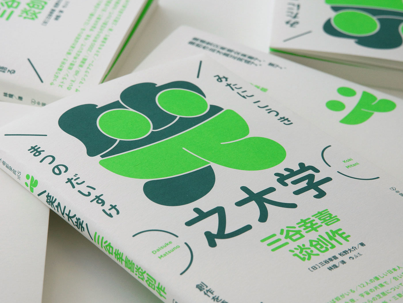
在最初接下這個案件時,我就注意到「笑」字的筆畫中應能放置一個笑臉。而編輯介紹這本書時整理了很多三谷幸喜的特質與理念,其中一些是:喜歡人偶、喜歡遊戲、有天真的玩心,我也進而在網路上查到,身為獨子的作者三谷幸喜從小就喜歡用玩偶排演故事,並表示幼時的獨處是其未來的創作養分。
綜合以上兩點,我就以圓潤飽滿的風格設計了一個帶有笑臉的「笑」字作為主視覺焦點,這個標準字既像個富有喜劇歡樂氛圍的玩偶(下半部同時也像一雙腿)、筆畫裡的笑臉也以螢光綠凸顯出,並讓笑臉單獨在正封以外的地方:書腰、內封、封底出現,以加強辨識度。
而飽滿的字體筆畫,除了捕捉玩偶的外型風格,同時也吻合三谷幸喜本身圓潤、大眼的笑顏形象。
The moment I took this case, I noticed that a smiley face could be hidden in the strokes of the kanji character for “laugh”. When the editor introduced this book, she compiled many of the characteristics and ideas of Koki Mitani. Some of them are: fond of dolls, fond of games, and have an innocent and playful heart. I also learn from the Internet that as the only child, Koki Mitani like to use dolls to rehearse stories since he was a child, and said that the solitude of childhood is the nutrient of his future creation.
Combining these two components, I designed a rounded logotype “笑”(laugh) with a smiley face as the main visual. This logotype is also like a comedian doll (the bottom half of the logotype looks especially like a pair of legs when viewed alone.) The smiley face is highlighted in neon green, and also placed outside the front cover— the belly band, inner cover, and back cover separately—to enhance recognition.
The plump strokes of the logotype not only capture the appearance and style of the doll, but also match the image of Koki Mitani himself: big-eyed and round smiley face.